Friday 22 May 2015

Evaluation of FMP

What happened?
Over the past 11 weeks I have been working on this FMP exploring the idea that sex is used in fashion photography to sell the product. Ive chosen 10 photographers to draft initial responses and say what I think their work is trying to say. Two of which I have done more in depth research into, Terry Richardson and Helmut Newton. I then shot 4 test shoots and a final shoot. My first test shoot I shot in the style of Helmut Newton, then the others were purely experimental ideas of mine such as maybe using pin hole cameras or using ascetate to print a digital image onto photographic film paper. My final photographs were shot with inspiration from Terry Richardson.
What have I learnt in the past 11 weeks?
In the most recent weeks I have learnt a lot, in terms of research I have found out a lot about lots of different photographers. And I have taken a lot of inspiration from almost all these photographers. In terms of practical work I have learnt that some certain methods weren't as successful as others. The ascetate printing wasn't successful because when printing out of the printer it would always scratch the print as it came out. The pinhole cameras didn't work because the quality was so low because of how long the exposure had to be.
How is it useful to me?
In terms of research, it was useful to me because I learnt how, the photographers I have chosen to research, they work and what they use and I then could adopt the techniques that they use. For example, Helmut Newton would often use a medium format camera, on location. This is what I did for my first shoot, I borrowed a Bronica medium format camera from Amy, the technician, and went to a friends house and shot provocative photos of my friend. 
             In terms of practical work, I learnt to not use certain techniques because it was not suitable for the work i was hoping to do. For example, when using ascetate to print my images, not only would the printer scratch the ascetate as it came out, but some quality was lost through printing it and therefore had an effect on the final outcome.
How are the images similar to the photographers I have researched? 
I feel that in my first shoot, I have done quite well to replicate Newtons work. I used a medium format camera, on location, a lot like how Newton did his work. I also feel I have retained a similar level of elegance seen in my photography and his. I've done this by using black and white, because it is often asociated with elegance and glamour. I've also done this by being particular in what I made my models wear. The male model, I made wear a suit and tie for I felt it enforces that idea of a higher class. The female model, I made wear lingerie for the same reason. 
In my final images I used my knowledge of how Terry Richardson shoots his models to shoot mine. However I realised something about his work after I shot the images. That he often makes his models do something that is iconic to him. If I would have know this I would have made the model do something iconic to me.

Evaluation of Final Images

What happened?
I traveled to my friends house to do a shoot inspired by Terry Richardson. My initial idea was to shoot in the studio of the college to achieve a true white background in my photographs, however it was very difficult to book the studio at a mutual time for both me and my models. So I then decided to go to a friends house and use his white wall as a make shift studio. Due to not having the studio, I was limited in the equipment I could use. I didn't have any professional flashes, so I was forced to use the natural light coming from the window. I didn't have a light metre so I was forced to simply guess the exposure using trial and error. I ended up using a shutter speed of 1/60 and an aperture of f3.5. The extra equipment besides my camera was a tripod.
How I felt it went? 
I was quite disappointed with not being able to use the studio. This inconvenience is visible in my images. The lack of professional flashes caused the images to not really have and true whites in them. However despite the lighting I am overall happy with how the images came out, they have achieved the  level of controversy I was hoping for. When asking people what they thought of the work, not telling them it was mine, I got mixed opinions, some liking them and others discarding them as sexist.
What would I do next time?
Next time I would ensure I am able to book the studio for both me and my model. I feel I could also explore using different models and more than one model in one photograph. If on the off chance I am unable to book the studio I will ask to borrow a portable studio kit, like a flash and a light metre.


Thursday 21 May 2015

Helmut Newton: Secondary research

'mixed reputation: as a serious photographer and a cynical pornographer.' This is a quote from the independent, it claims that there are two opinions with his photography. I found many articles claiming he's 'the worlds most inspirational fashion photographer' and other discarding his work as being 'perverted'. In my research I found that he almost always uses medium format, this gives you the same as using 35mm film, but retains the quality of a digital camera. He also often shoots on location as well as studio, this has an effect on the narrative of his images, the models are often in what looks like very elegant places which when used as commercial photography it is used to not only sell the cloths they are wearing but also used to sell the lifestyle these models live. 
                I then asked 'why do you think the use of black and white has been used?' To which most responses were that is was used to enforce the idea of elegance and glamour in the narrative of the photographs. This is because we often associate black and white with glamour, it is often used to sell lifestyle hence why it is used for a lot of high end brands.  


Helmut Newton: Primary research

Again, because I'm quite limited in what I can do as I'm a student, I again decided to create a survay and ask students and teachers what they thought of Newton's work. A common response was what I expected. That it seemed very based around male dominance and people often found it to be quite sexist. Even when I asked one of my tutors, he said he felt his work is representing male dominance, but when I then asked another tutor what they thought, he agreed with me in that there's a deeper meaning. That with deeper analysis you can find that it's actually the opposite. 
               I then asked people what they thought the purpose of his work is and where it would be used. That was quite inconsistant, some people felt his work would be used as magazine covers and others felt his work is more suited for exhibitions. His work was often used for both, so it's obviously quite clear what it is used for. 


Terry Richardson: Primary Research

Because I am quite limited in the primary research that I'm able to do, I decided to construct a survay, asking questions to people what they feel Richardson's work is all about, without giving them any information about him. This is so I can gather other initial responses about his work and see what the public thinks. I asked my friend, who considers herself a feminist, what she thought of his photography, to which she replied 'generic'. She thought that his work is basically like every other fashion photographer in that it features a celebrity or a very attractive person wearing very provocative clothing, using the idea of using sex to sell. What I can learn from this is that Richardson's work is very inspirational to other photographer who work in a similar way and to the industry for him to be 'generic'. I then asked one of my tutors what they thought of his work, to which she felt that he plays on people's weakness' in that the majority of his celebrity models are tabloid tragics, people that are often ridiculed by the public. I then asked a fellow student and they raised a point I didn't think of but agree with, through the way he gets his models to pose doing something iconic to him, such as the thumbs up or the glasses, he might be obsessed with his own identity, or it could be a tag or a mark to let people know that it is his work.
              I then asked people what the purpose of his photography is to which most people replied it would be a front cover for a magazine maybe vogue or another high end magazine. Some people thought because some of the clear branding in his work, featuring brands such as Supreme, it could be for advertising and commercial work.


Tuesday 19 May 2015

Secondary Research: Terry Richardson

One of the first things I saw after typing in 'Terry Richardson' was an article titled 'Is Terry Richardson an artist or a predator?'. This enforces my idea that his work is subject to be taken in the wrong way and to be discarded as the work of a perverted man. After looking deeper into his work and his personal work, I found that his personal work is a lot more graphic than his commercial work, often featuring himself naked and erect, that many find pornographic and misogynistic, and which can make viewers feel very uncomfortable. He has been called 'the worlds most fucked up fashion photographer' by the website jezebel, 'fashion's shameful secret' by the guardian and 'Americans next top scumbag' by wonkette. I personally disagree with these opinions, I feel it's narrow minded to ridicule his work because it makes some people feel uncomfortable.
                 Richardson has a very distinctive and recognisable method. Shooting his models head on, with a bright flash against a white wall. He excels something increasingly rare in fashion photography, what the designer of Tom Fords calls 'capturing a very real moment'. Richardson's own fame is due, partly, to his habit of including himself in shots of celebrities and partly to his formal consistency. I noticed that most people who are photographed alongside him adopt some aspect of his signature look, such as his glasses or thumbs up gesture.


Monday 18 May 2015

David Hockney primary research

David Hockney Primary Research

To do this type of research I am limited in what I can do. What I decided to do was draft a short survey, in which I would ask people what they thought about Hockney's work. Something I found with his work, when asking friends, is that most people are familiar with Hockney himself, but wasn't very familiar with his work. I asked 'what are your views on Hockney's work?' And I'd often be forced to show them his work because they didn't know his work but knew him. A commen response was simular to mine, in that they didn't quite understand the point of distorting the model. One person raised the point that he is trying to incorporate the idea of three dimensions in a medium that mainly consists of two dimensional work. This person also recognised that Hockney is clearly using Picaso for his inspiration


David Hockney

My initial reaction is to question the purpose of this photo and others like it, for i do not quite understand what these images are trying to say to its audience, what this image does is create a strange distortion in her face, which has quite a freaky effect. His work was clearly inspired by the art movement 'cubism', a movement created by Pablo Picaso, it's purpose was to create a new and different perspective on modern art, something that Hockney has defiantly done. In cubism artwork, objects are analysed, broken up and reassembled in an abstract way, instead of depicting the image from one viewpoint, the artist depicts the subject from many to represent the subject in a greater context.However, I don't feel that Hockney's work is less randomly placed than Picaso's, it feels a little more organised and therefore the image is clearer.


Sunday 17 May 2015

Plan of shoot 01

For this shoot I am going to use inspiration from Terry Richardson to accomplish provocative fashion photographs. I plan to do this with my nikon d3100 camera and a tripod, because I found it difficult to book the studio, I was forced to do it in my friends bedroom, it has white walls which I hope will create the same effect as being in the studio.
             I will set the White balence to cloudy for I do not have and flashes and my only light source will be the sunlight coming through the window. The light is quite dark so I'll have to use a large aperture of f3.5 and a slow shutter speed of 1/60 of a second. To keep image quality I set the ISO to 100
              I'll be using two models both a boy and a girl, the girl will be wearing a very provocative outfit, with an obvious branded piece of clothing to ensure it being commercial photography. The boy will be topless and a brand on show having a similar effect.  

Tuesday 12 May 2015

David Hamilton

The first thing I noticed when looking at Hamiltons work is that it is very grainy and gives a kind of tired effect. I then looked at the models and it looks as though they have just had sex, due to the position and facial expression. The models appear to be very young which I feel would make it a easy to be considered to be controversial and subject to criticism. It's difficult to establish a narrative in the photographs other than the model having just had sex maybe with the photographer or someone else.
                       The meaning or purpose of these I feel would be suited for only fine art purposes. I can't imagine these images being in newspapers or magazines. These images would probably be exhibited and shown to the public. It's easy to discard it and the photographer for it to simply be pornography, there's an idea of fetishism, this could simply be to let the viewer gather an idea as to what the photographer is interested in.
                The grainy effect you see on the photographs has probably been done by a special filter however another method could be used by simply putting women's tights over the camera lens to create a similar but not as good effect. It has probably been done to express a tired attitude within the image, enforcing the idea that the photograph has been taken in the morning with the models having just woken up or them having just done something tiring.
                My tutor was reluctant to show me his work and it's easy to understand why due to the nature of the photography, it featuring what looks like underage girls posing as if they've just had sex. If I was to further my research on the Internet I'm sure I would find countless amounts of posts ridiculing and discarding his work of being pedophelic and sexist.


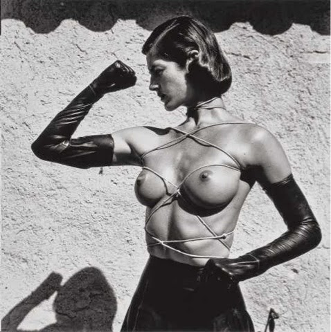
Helmut Newton

My initial response to Newton's work is to think, at first glance, that his bodies of work are based around the idea of male dominance however when looking deeper at the images I realise that there is more to these photos. I realised it is actually the complete opposite. I feel it is to express female dominance and their control over men. In this first photo you see that a man is grabbing the women in a way which looks like he has no permission to do but she lets him, but also seems as though she doesn't even care about what he is doing and doesn't take notice, Enforcing the idea of female dominance.
                The meaning or purpose I feel could be for both commercial use and fine art. I feel it would be used commercially because in the photographs there are clearly branded products, for example the watch in the first photo. However, in images with no clear products, the focus is the narrative of the image and that idea of female dominance. The images look very professional apparent by the quality of the images. However most of the images are done on location, I feel this is because it brings out more of the story within the image.
                   Almost all of his images are in black and white with a high contrast. This is probably to enforce the idea of a higher class and elegance. Because of this it also plays a role in the narrative of the photo because we associate black and white with elegance which tells us something about the photo. I noticed that a lot of his work is done using low key lighting which creates quite a negative atmosphere on the photograph.
                  It's easy to understand how is work is something to be negatively criticised for being sexist and objectifying to women. However, I feel that if you look deeper within the images you find that it is not. These negative opinions are probably from people who are not educated in art and the ones who prove these opinions wrong are people like writers of the BJP.


Monday 11 May 2015

Interview: Dave Thompson

What equipment did you use? 
Fuji rdp100 film
Haslsselblad film camera
Large tripod
Bowens quad lighting
1/8 warm up filter 
90mm lens
What was the meaning or purpose of the shoot?
Primarily it was a test shoot however after shooting loads of girls in a blank background, he found that the background is very important. The narrative is very basic in that it's simply about to have sex with that girl.
What drove you to use transparency film?
At the time, if you wanted to be set apart from the amateur photographers, this is what you used.  
What or who were your influences? 
Ian sprat, was a page three photographer for the daily mail. Dave, at that time, wanted to shoot those sort of photographs as his career. 


Dave Thompson

My initial response to daves work is that there doesn't appear to be much narrative. The work seems quite commercial, possibly test shoots for an agency. I feel the lack of narrative may be because it is not personal work and could may be used for advertising instead of being exhibited. The images appear to be quite formal, using professional equipment, apparent by the quality of the images.
                  The meaning or purpose of the images, I feel, would be used for advertising or modelling. Or another purpose could be used as pornography. The model is looking directly looking at the viewer, enforcing this idea of provocative photography. She is wearing very provocative clothing, not something to be worn every day, it looks as though she is looking for sex and has prepared for it. It's quite objectifying in that you don't really learn anything about the model other than she appears to be a sex object.
                  The colour used in these images appear to be quite saturated and use very warm colours. This maybe a use of visual language, in that these warm colours are very advertising to a viewer, enticing them to join her. The clothing the model is wearing seems very elegant implying a higher class of person, the bedroom also has a similar effect in that it appears quite expensive. 
                 The equipment used appear to be quite professional, using maybe an expensive camera and lighting 


Tuesday 5 May 2015

Nobuyoshi Araki

My initial reaction to his work is to be stunned how blunt it is and he's simply having sex with his clients. The images appear to be informal because it looks as though it is ambient light used. It makes me question if this is used as art or an excuse to have sex with naive models. It's clear that his work is considered controversial and I can imagine that his work was often ridiculed and discarded as sexism.
            The meaning or purpose for these images are, I feel, very vague. It is difficult to have an educated guess as to what the meaning might be. After asking a student what they feel is the meaning, to which he thought that maybe his work was to express his own fetishes and sexual desires with no regard to sexism. I find it very objectifying to women amongst a lot of other people who have reviewed his work. Some images varie in how some look very professional in that they have clearly been done in a studio with flash and other look less professional with ambient light and a very low quality.
                  Because some images appear to be professional and others not, this is visible when it comes to the colour. Some images have a very high contrast with both true blacks and true whites. However others are very soft with lots of greys. This has an effect on visual language in that the ones with a high contrast appear to very elegant and more pressional, whereas the photographs that are soft appear unprofessional and look more so the subject are of a lower class. Most of his photographs are in black and white, this gives a quite dark and gloomy atmosphere to the images.
                 I personally feel that his work is very objectifying. It seems as though he has used the idea of being a professional photographer to sleep with and use these models, taking advantage of naive models. It's easy to understand why his work is controversial and subject to a lot of criticism.


Review of third test shoot

What happened?
I went to the balcony to explore different depths of field using a pin hole camera. To do this I decided to use George as a model and simply stand in the same place whilst I shot him using two different cameras. I had no control over the cameras settings for there are none, the result of this was it took me a few tries to achieve a successful image. However I was unable to produce a successful image using the small camera because it was very difficult to find an appropriate exposure time, after five attempts I gave up.
How do I feel it went?
I was disappointed by the end of the shoot because I ran out of time to discover a good exposure time for the smaller box. As a result I do not have a successful image to show you. However, when using the large box it took only two attempts to establish a good time of three and a half minutes. The big issue with only having one successful image is that I have nothing to compare the depth of field with. I feel I will learn from this mistake and now can make an educated guess for the exposure next time other than completely winging it.


Analysis
Unfortunately, due to me only having one relatively successful image I cannot compare it to anything, however I can analyse this one image. I feel the image has a lack of contrast and therefore is very soft with mostly only greys and very little true blacks and whites. I think this is a result of a too low time of exposure. Next time I use this camera I will have about thirty seconds longer, this will hopefully give the image a better contrast. Because the image must have a very long exposure, it is very easy for the model to be slightly blurred if he or she moves at all, it only takes a slight movement to blur him or her, and my model moved quite a bit, apparent fro the blur. All I can do to stop this is to ask the model to remain completely still which is unlikely. However, the parts of the images that are sharp, are sharp because they do not move.
Conclusion
After understanding how difficult it is to shoot a perfect image using this technique I have learnt that I will not use this method for my final shoot. It is too difficult and time consuming to establish an exposure time. It's also difficult to use trial and error and use the same results another day because the light may have changed and therefore forcing you to start all over again.