Thursday 19 November 2015

Experimenting with van dyke brown prints

For this experiment I will take the negatives I shot in the style of David Bailey and use van dyke brown to to print them on card. In this process I will have to paint the chemicals onto the card, drawing an outline before hand, wait for it to dry, then place the card on an ultra violet light box with the negs on the top. After testing the exposure I found that the correct one was 100 seconds, I then place into another chemical, at this point the photograph turn a straw colour, I then wash it in a soft fix, this is when it turns a chocolatey brown. I then wash with water and wait to dry.


Context on David Bailey

Baby boomers
People who had babies after the war
Forced to go to the army
Limited food
Struggled from education from learning difficulties 
Taking pics of birds
Very well established photographers
His passion for photography was fuelled by his enjoyment, photographing birds as a child
When he was sent to the Royal airforce and deported to syngapor he bought a cheap medium format camera
After finishing his years in service he pursued his photography career and got his first paid job shooting a friends wedding
Decided he wanted to work for a photographer, he wanted either Jon French or Armstrong Jones
He worked with French 
Left French in April 1960
He got his first big job at the daily express 
Images created from this job were instantly recognised as influential and and inspired other photographers very quickly
Vogue then offered Bailey a job, he then refused and made him another offer of which he took 
Within 8 months of joining vogue, he published his first cover photo
He lived with his model, and photographed her almost exclusively until 1964 
Lewis Morley

Review of final David Bailey shoot.

What happened? 
I photographed my friend in underwear in the style of David Bailey. I rented out both the studio and a medium format camera. I then processed and printed the photographs myself. A huge issue I encounted with the photographs was during the processing stage, upon taking the film off of the sprawl I immediately noticed there was a huge cream coloured smudge all down the film. I knew that this was from during processing the film was stuck together and therefore the fix couldn't get to all of the film. I decides to pour some fix into a tray and put the film again. Luckily most of the smudge disappeared, however there was some still on the film, and on a couple of photographs it is noticeable. 
What went well? 
Other than the one issue with processing the film, I feel it went quite well. I feel I was successful in replicating a similar lighting to david Bailey. My aim was to keep the model in the light however not the background, keeping it grey. To do this I took a poly board and put it in front of the light, covering about a third of the bulb, preventing the light from falling on the wall behind the model. Something I didn't intend for but I feel added character to the photograph was the amount of shadows on the model. If I was to do this shoot again Id keep a similar lighting because I like the drama it adds.
What didn't go well? 
I feel through out this shoot the two big issues was the problem with the fix, which if I was to do this again I would ensure the film has been put on the sprawl properly, preventing it from being stuck together. The other issue I encountered during printing. Because the enlargers in the dark room aren't designed for medium format film, I was forced into making a frame out of card so that the frame could be included in the photograph. However because I had to make this frame myself, I feel it compromised the quality of the image. It was quite unsuccessful because I could only include one edge of the film because the frame wasn't big enough to include both, if I was to print this film again I would ensure I used an enlarged designed for medium format film


Wednesday 18 November 2015

Plan of final David Bailey shoot

For this shoot I will do similar approach to  my test shoot. For I feel it was quite successful. However this time the nature of how the model is dressed will be very different. I've decided to do an underwear shoot but still keeping a David Bailey format. My plan is to bring in a friend to model for me, to do this I have to send an email to my tutor informing him of all the details of the shoot. For example my name, the models name and the time in which Id need the studio. I plan to spend only an hour in the studio. I will again use a medium format camera. Both because it is the type of camera that Bailey used and I feel the quality of photograph it produces is brilliant. When printing I will include the boarder of the film, because this is technique I used in my test shoot which I feel looked good and this is what Bailey did
             I will be shooting in the college studio, to do this I will need to borrow a studio kit from the college. I will set my apeture to f8 and my shutter speed to 1/125.

Monday 16 November 2015

Context


The Corrine Day period marked a massive change in the way photography was produced, it was proceeded by a massive economic boom and wealth distribution. Models were paid ridiculous amounts of money and photo shoots were done in very exotic locations, reinforcing the sense of wealth and luxury. As the 1980s finished and we moved into the 1990s there was a huge economic crash worldwide. The music of 1980s was house music - acid house all of which celebrated life and good times. In USA Kurt Cobain was forming the band nirvana - this was the anti-thesis of happy go-lucky care free acid house and marked the change in the worlds mood. Away went synthesises and in came rock and roll, music that reflected a new world. A darker economically challenged world. Heroin replaced acid and ecstacy as the drugs of rock musicians and kids started to copy
'Grunge'. Cobain coined the phrase to describe the movement in the USA. The media picked up on the 'look' and the fact heroin was being talked about and used. Kids in the United Kingdom adopted the look and lifestyle, combining the fashion style with taking class A drugs. The term 'heroin chic' was coined to describe Courtney Love and the new look. Models got skinnier as a reaction to the busty 'uber babes' of the super model phenomenon. Kate moss was considered at the same time.

Corrinne Day

Corinne day - Kate Moss
My initial reaction upon looking at this photograph is to question why the photographer has chosen to present the photo in black and white. I don't quite understand why black and white is used, because of the nature of the photograph I would've thought it would be in colour because the model looks happy and joyful, which is the opposite to the visual language that black and white often represents. The nature of the photograph, because of the time it was published, is very different from photography around that time. It looks as though this would have been one of the first photographs to have been published with such a casual, easy going style, instead of the glamorous format that most photographers would have used. 
I'm predicting that from the shape and texture of the image, it is 35mm film, it wouldn't be medium format because the shape of the image is not squared.
           From the body language and facial expressions it looks as though she and the photographer are trying to sell this joyful, spontaneous life style. This is what makes it fashion photography, it doesn't have to be clearly selling a product that is featured in the photograph, it promotes the brand by simply showing that if you wear this or do this, you will live and look like this.
             I feel that both the model and the background work well together in that we often associate the beach with sun, sun bathing and wearing revealing clothes, Moss has done almost exactly that however taken it to not wearing anything. Because of this it gives the happy feel to the photograph, however I feel that if only the model was not in the image it would have a very different feel, it would look a lot less bright and joyful and a lot more dark and mundane because of the use of black and white and what looks like an untouched background. Personally I don't like the composition of the photograph, I don't quite understand what the photographer has chosen to cut the image off at her toes, I feel that there is too much space between her head and the top of the image, I understand that that could have been used to emphasise her vulnerability by showing that she's in a huge isolated place, however I feel the model would have been better suited filling more of the image


Thursday 5 November 2015

Careers

Cinemaphotographer
Being in in control of the camera team, frame and light of film
Required to have an artistic ability
Hours long
Start off from the bottom of recording
Can be paid up to 65000 for one production
Not necessary for agree but does help
Demand has increased

Free lance photographer
Online portfolio required
A lot of money require to get started

Art therapy 
It uses art to improve a persons physical and emotional well being
Need a degree
25000 average salary

Forensics photographer
42000-50000 salary
Three years of experience in photography 
Highly organised

Photographers assistant
It's done to start one off, to then gets you up into the career of a photographer

Film director 
Control everything in the making of a film
Average salary 90000-180000

Curator
Manage staff in galleries and exhibitions
Decides how the work is ️gona be hung

Social networking designer
Focus on how the clients website looks and work
Some sort of degree is required
Engaging with your target market
Get the point across through a website
A lot of research in your clients company

Documentary photography
Often used as photojournalism 

Art director 
Degree required 
Work mainly in advertising

Graphic design
Salary 22000-28000
Degree required
Portfolio

Commercial photographer
Mainly work in studio
Self employed 
Degree not required but need experience 
Workexperience@southessex

Review of test shoot

What happened?
I booked out both the studio and a medium format camera and used my classmate, Shane, as a model. Before the shoot took place, we discussed outfits he could wear to fit the context of this assignment, we put together stone washed jeans, white t shirt and timberlands. I found it quite difficult the styling because neither of us own 60s clothing. When looking at Bailey's work I noticed that he often includes the edge of his film in his photographs, I want to try a simular approach when printed, however it was more difficult than I initially thought.  Because the enlargers aren't made for medium format film, we had to create a frame large enough to expose all of the film, including the edge of it.
How do I feel it went?
Overall I feel the shoot was successful. I'm happy with how I did the lighting, I was successful in keeping the background grey however still keeping the model well lit. 
What didn't go very well?
Annoyingly, I feel that I placed the model in the wrong place, because of this you can see the curvature of the infinity wall. If I was to do this shoot again I would shoot the photographs against the infinity wall instead of adjacent to it.
Conclusion
Other than a few tiny issues that are easily fixed, I'm happy with the photographs. I feel that I was successful in showing my inspiration was david Bailey. I like the contrast between the blacks and whites. One thing that I would like to change would be the styling.


Plan of David Bailey test shoot

For this test shoot I'm going to use david Bailey for inspiration. Because of this I will use appropriate materials and techniques to produce a small body of work. I've decided to work using medium format because it is what Bailey used, and I like the quality of film photographs it produces. Upon looking at a lot of his photography I found that, when shooting models, he often uses a grey background. To replicate this, what I will do is use a poly board as a light baffle, to cover some of the light and stop it from falling on the background. 
            I plan to spend about an hour shooting in the studio. Kit I will need when shooting will be a medium format camera which I shall book out and hp5 medium format film
I will use and aperture of f4 and a shutter speed of 1/125
ISO:100
 

Thursday 8 October 2015

Plan of test shoot

For this test shoot, keeping the concept of typology, I've decided to go into arcades in southend and photograph slot machines. The idea is to show the difference between old and new arcade games. For this task I will use my dslr nikon because I don't have a lot of time to print off the images, therefore it would not be very appropriate to use other camera formats such as 35mm film or medium format cameras. 
I shall shoot all the slot machines in the same format of portrait. This will make the images look a lot better when they are joined up to make one image in a grid.

View cameras

The Bechers used view cameras as they were appropriate for the task they set themselves, the negatives were very big, probably 5x4. Bigger camera formats have less depth of field so if the background detail was irrelevant, this helps throw the background out of focus. Due to the size of the negative, the quality of the image was impeccable and enables the prints to be enlarged. As the Bechers intended to use their work in exhibitions. This format was therefore appropriate.
A - front lens and panel
B - this is the 'darkslide'. It's basically a film cassette that has two sheets of film. This slots into the back part of the camera.
C - bellows - these compress and stretch as the camera 'standards' along the rail G.
D - lens which has the shutter speed and aperture setting on it.
E - these are the controls that change the focal length and focus the camera.
F - tripod needs to be a decent size.

Monday 28 September 2015

Context on the Bechers

'Moved' by the architecture 
1958 1st images 6x9 linhoff
Siegen, Germany - autobiographical
Mining industry through family connections
Rhur region, France and Wales 1965
1972 - USA, industrial regions of Pennsylvania
Heavy industries were their subjects
Shape, form and structure
"Objects that can be compared as a historical thread"
"We wanted to keep them" - emotional attachment
"Photography" - way of keeping
"Doomed to disappear" Bernd realised they were doomed to disappear and he felt it needed recording
Classification - varieties of types
Form of presentation - typology - examining the type
In the work no.1 bare a resemblance to no.9 in the typology 
Equipment:
Telephoto lens - distortion
600 mm 2x7tripods to avoid vibration
Difficult to shoot in the winter (bare trees)
Used fog to obscure the fussy background.
Long exposure, large format, small apertures, sharp depth of field and shot on cloudy days, f32 or f45 with a 20 second exposures "lovely moment capturing the exposure times"
Composition - central and similar details. Horizon below 3/4 mark.
Format: 30x40
60x50cm prints

Thursday 24 September 2015

Gibbs Reflection on final shoot

What happened?
I took a Pentax k1000 film camera, loaded with hp5 film. I chose specifically hp5 film instead of fp4 because it has more grain, I thought this would add well to the idea of being dark, mundane and gloomy. During lesson, I walked around southend with the intention to go behind shops and photograph them. The idea was to take Gohlke's idea of photographing the backs of billboards showing the reality behind a brand and do it with a slightly different approach. The shoot only took me about an hour, I spent only a short amount of time because I was tasked with shooting, processing and printing in only about three hours. Processing went well, however because I didn't have a lot of time to print, I found that my photographs turned out quite soft, what I could have done is used a contrast filter to make the blacks a little blacker and the whites a little whiter. 
How I feel it went
I'm not completely satisfied with the outcome of my final images, if I had more time I would have gone to london and done the same thing, what I found was a bit of an issue was the back of all the shops all looked very similar, with bins and broken glass on the floor. Another thing I could have done to emphasise the dark look was put a pair of tights over the camera lens, this would have given the photograph a very grainy effect, this would have made my work slightly resemble nakahira's work.
Conclusion
Overall I'm happy with the result however I do feel there's room for improvement. I think what I should have done is been a bit more experimental with the shoot and the printing, one example would be the tights idea. With the printing I could have used a filter to up the contrast on the photograph, I could have burnt in places which are a lil overexposed from the sun, or another experimental idea would have been to scratch the film adding to the gloomy effect.

Takuma Nakahira: secondary research

What I found when researching Nakahira's work and himself I found that he was very well known for being very articulate when talking about his art and others. I found that he was an editor for a magazine called 'The New Left' in 1963. Working here, he met photographer Shomei Tomastu. Through this meeting, Nakahira found his passion for photography. Through Tomatsu he met a range of other respected photographers. With them, they created the magazine 'Provoke' which is still a leading magazine today. 
                 Something I saw a lot when researching was the articles emphasising how influential and respected he is as a photographer and artist. The ASX website described him as a 'legend'. I think what made Nakahira so successful was that he was not only a good artist but he was a very interesting character. Nakahira was described by the American suburb x as "An essayist and photography critic, a political activist, a photographer who talked too much, a photographer who lost his memory, a photographer who forgot his mother tongue, a legend…" 


Wednesday 23 September 2015

Frank Gohlke: primary research

For my primary research I decided to draw up a questionnaire, and ask people I know, what they thought of Gohlke's work. My first question was 'Do you think this work is different at all from traditional landscape photography' to which the answers of this question surprised me very much. A common response was simply 'not really' the only slight difference was that all of his work was in black and white and 'that's not always used in landscape photography'. I feel the reason for this common response to his work in that it's not that different from what people are used to, is because he did this work 40 years ago and therefore, I can imagine, at his time it was never done before but now that he has influenced a lot of photographers and people have a lot more access to photography his work has become the thing he specifically set out to try and not to be, generic.
                  I then asked what people thought the purpose was for his work, to which I got a few responses saying it was fine art and was done to be hung up at a gallery. Other responses were that it looked as though it could have been used for documentation purposes, which I guess both of these responses would be correct, his work is hung in galleries and it was done to document man made constructs.


Frank Gohlke: secondary research

There is something peculiar about the way we attribute the clarity of some photographs to the world itself. I try to reinforce that paradox by making photographs that convince the viewer that those revelations, that order, that potential for meaning, are coming from the world and not the photograph.
— Frank Gohlke, 1979

This is a quote I found from Gohlke. What I think he means by this is that he's not content with how landscape photography was at the time done, it was more about the beauty of the photograph instead of what is in the photograph, what, I feel, he means that is that his photos are very unedited and are more about what the photograph is of and less about the photograph itself.

"Gohlke is unusual among photographers for his willingness and ability to articulate his ideas verbally as well visually."
Quote from placesjournel.org

This quote illustrates why Gohlke is such a successful photographer. He is able to not only photograph what he finds beautiful, he's able to talk about and explain why it's so artistically beautiful. 


Monday 21 September 2015

Plan of final shoot

For my final shoot I will use a lot of my inspiration from Frank Gohlke in that he chose to photograph the back of billboards, I've decided to walk round to the back of shops and photograph that scene, I hope it will have a similar effect to Gohlke's work in that my concept shows reality lying behind what brands are making up and trying to sell. It will also set my work aside from traditional generic landscape photographs.

For this shoot I have decided to use a film camera because I feel it will do better in achieving a mundane look through the use of grain. I've chosen to buy hp5 ilford black and white film for it is better for 

grain than fp4.
I will use a shutter speed of 1/125
Aperture of f8
And set my ISO to 200

Plan of random landscape shoot

The random task I have been set is 'places men urinate having left the pub'
My plan for this shoot is to go to small alleyways next to pubs, and photograph where I feel men would urinate, I want a dark and gloomy effect, to do this I think I might underexposed the images slightly, giving the images more blacks.

I will use my nikon d3100 
It is a sunny day so I would normally set my white balence to sunny however, because I'm going to dark places, I shall set it to shady.
My shutter will be set at 1/250
Aperture at f8
ISO 100

Because I am shooting these images on digital, I am able to achieve that mundane look I want on photoshop if I am not satisfied with the unedited version. I only aim to spend about an hour on this shoot.

Sunday 20 September 2015

Frank Gohlke

PMy initial response to Gohlke's photography was to notice they are mostly landscape photographs of mundane man made constructs, to then wonder what the meaning was for doing this. I feel it is to document what we are doing to natural landscapes and potentially ruining them by urbanisation and suburbanisation. The reason Gohlke began shooting photographs like these was because no one had done it before, and him and nine other artists felt the same way in that they were bored of the generic, beautiful landscape photography and decided to do the complete oposite.
             I feel the meaning or purpose would be to be exhibited in galleries, this is because it is clear this work is personal work. He has chosen to take these photographs because he wants to, not to be paid to do so. The work would be successful in galleries in that it makes the viewer think about what it means, my impression is that it reveals reality behind a made up lifestyle by the brand on the front of the billboard.


New topography

Group of photographers in 1975 who were bored of generic commercial work, so what they did was put on a huge exhibition exploring man made contemporary landscapes. Frank gohlke and Stephen Gill. The context and purpose was to explore their own passion for photography and come up with their own concepts. The way they did this was by taking billboards with glamorous adverts on the front and turned that idea around, and decided to photograph the back of them, then named the photographs after the brand the billboard was advertising. I feel it was an analogy for reality in that companies try to sell to you a better way of living whereas the mundane other side shows what life is really like. Or it could be that the front of the board shows the glamorous product and then the back shows what it's like making them.

Reflection on land scape shoot

What happened? 
We were set a random task to take pictures of 'places where men urinate after having left the pub'. I went out for an hour and shot several photographs using my nikon d3100 camera. It was quite a good day to go for a shoot for it was quite a sunny day, giving me the option to set the White balence to 'direct sunlight' and used a small appetite and a fast shutter speed.
How I felt it went?
I felt it was was quite difficult to document places in which people urinate after having gone to the pub and keep it in a landscape format, I feel I was limited to the photographs I was able to take because I did not have a wide angle lens which would have made the images more appropriate for landscape photography. I haven't yet put the images on the computer and edited them, once I do I will do another reflection.
What was bad?
I took a few photos in dark corners, the issue I found with that was because it was so bright there was a huge contrast with the bright areas and the dark areas making those images a little underexposed however the ones shot in sunlight were fine.
My conclusion
Overall I feel the shoot was successful in that the photographs came out with the mundane feel I was looking for, however what I would do next time is maybe instead use a film camera instead of my dslr, because I feel, using hp5 film will give the photographs a natural grainy effect, giving it a more dark and gloomy feel.

Thursday 17 September 2015

Ethics

Ethics in the context of photography, involves things like is it or is it not ethically correct to photograph a specific something. The pros for using photoshop  to touch up photographs taken specifically for advertising or front covers, would be that it is incredibly helpful with raising awareness of how one brand's product is better than another's. However I understand the argument for it being unethical to change the way someone looks with the purpose to sell, it creates unrealistic expectations for the way people look.
 This photo was edited by a photographer working for the times,  it shows OJ Simpson edited to appear with much darker skin than what he has in the unedited version. The controversy this caused was because the public put this editing down to racism, however the photographer explains that it was only used to make the subject more sinister and intimidating which is understanding considering what he was being prosecuted for doing, murdering his wife.
 This is another incredibly controversial photograph, it's quite clear why. This photographer, Kevin Carter, sat waiting, for hours, for the perfect photo of a vulture waiting for this helpless child to die to eat him. it's considered unethical by a lot because he, instead of choosing to immediately help this child, he chose to take advantage of the situation and photograph it. However the argument for the photograph is that it raised a lot of awareness about the poverty and starvation going on in Africa but also made people talk about it, so in a way by documenting this tragedy, he's gotten more people involved in the issues with Africa. 

Monday 14 September 2015

Takuma Nakahira

My initial reaction to Nakahira's body of work 'fire and water' was to notice the amount of grain used in his photographs. I imagine the reason as to why this is done is to achieve a decayed feel to the scene, the places in which he has chosen to shoot his photographs appear to have been taken in what looks like a torn place, be it by war, the sea or fire. In his images of the sea it could be representing, through the sea crashing againg concrete or man made constructs, attempting to 'reclaim culture' a quote from the international journal of photography, a forlorn hope than realistic expectation. Meaning it represents how people, in life, are constantly trying to achieve something they want, however the want is never ending, once achieved there's just another thing afterwards we want more. 
              The meaning or purpose of these I feel would be suited for only fine art purposes. I can't imagine these images being in newspapers or magazines. These images would probably be exhibited and shown to the public. It doesn't seem to be commercial photography as it does not have a clear product it is trying to advertise. 
               The grainy effect you see on the photographs has probably been done by a special filter however another method could be used by simply putting women's tights over the camera lens to create a similar but not as good effect. This use of visual language gives the photograph the dark and gloomy effect it has


Thursday 10 September 2015

Fashion photography job research

Fashion photography highlights clothing and other fashion products in exciting and memorable ways. Fashion photographers work closely with models and fashion designers to conceptualize and shoot photos that showcase fashions as effectively as possible. Fashion photographers may be employed by fashion magazines, catalogs, advertising agencies or fashion houses. They may also be self employed.
             To study fashion photography at a university level, the qualifications required are a foundation diploma in art and design or two passes at a level. And three passes at gcse level. 
The university of art london asks for applicant to demonstrate '  

Student Selection Criteria

What We Look For

The course team seeks to recruit students who can demonstrate:

  • An ability to communicate ideas visually
  • a commitment to and knowledge of critical debate around the body and its representation
  • An ability to cope with the academic demands of the course
  • A commitment to self-motivated study
  • An interest in the fashion imaging industry
  • A portfolio showcasing photographic imagery indicating an appreciation of contemporary fashion image making'

Friday 22 May 2015

Evaluation of FMP

What happened?
Over the past 11 weeks I have been working on this FMP exploring the idea that sex is used in fashion photography to sell the product. Ive chosen 10 photographers to draft initial responses and say what I think their work is trying to say. Two of which I have done more in depth research into, Terry Richardson and Helmut Newton. I then shot 4 test shoots and a final shoot. My first test shoot I shot in the style of Helmut Newton, then the others were purely experimental ideas of mine such as maybe using pin hole cameras or using ascetate to print a digital image onto photographic film paper. My final photographs were shot with inspiration from Terry Richardson.
What have I learnt in the past 11 weeks?
In the most recent weeks I have learnt a lot, in terms of research I have found out a lot about lots of different photographers. And I have taken a lot of inspiration from almost all these photographers. In terms of practical work I have learnt that some certain methods weren't as successful as others. The ascetate printing wasn't successful because when printing out of the printer it would always scratch the print as it came out. The pinhole cameras didn't work because the quality was so low because of how long the exposure had to be.
How is it useful to me?
In terms of research, it was useful to me because I learnt how, the photographers I have chosen to research, they work and what they use and I then could adopt the techniques that they use. For example, Helmut Newton would often use a medium format camera, on location. This is what I did for my first shoot, I borrowed a Bronica medium format camera from Amy, the technician, and went to a friends house and shot provocative photos of my friend. 
             In terms of practical work, I learnt to not use certain techniques because it was not suitable for the work i was hoping to do. For example, when using ascetate to print my images, not only would the printer scratch the ascetate as it came out, but some quality was lost through printing it and therefore had an effect on the final outcome.
How are the images similar to the photographers I have researched? 
I feel that in my first shoot, I have done quite well to replicate Newtons work. I used a medium format camera, on location, a lot like how Newton did his work. I also feel I have retained a similar level of elegance seen in my photography and his. I've done this by using black and white, because it is often asociated with elegance and glamour. I've also done this by being particular in what I made my models wear. The male model, I made wear a suit and tie for I felt it enforces that idea of a higher class. The female model, I made wear lingerie for the same reason. 
In my final images I used my knowledge of how Terry Richardson shoots his models to shoot mine. However I realised something about his work after I shot the images. That he often makes his models do something that is iconic to him. If I would have know this I would have made the model do something iconic to me.

Evaluation of Final Images

What happened?
I traveled to my friends house to do a shoot inspired by Terry Richardson. My initial idea was to shoot in the studio of the college to achieve a true white background in my photographs, however it was very difficult to book the studio at a mutual time for both me and my models. So I then decided to go to a friends house and use his white wall as a make shift studio. Due to not having the studio, I was limited in the equipment I could use. I didn't have any professional flashes, so I was forced to use the natural light coming from the window. I didn't have a light metre so I was forced to simply guess the exposure using trial and error. I ended up using a shutter speed of 1/60 and an aperture of f3.5. The extra equipment besides my camera was a tripod.
How I felt it went? 
I was quite disappointed with not being able to use the studio. This inconvenience is visible in my images. The lack of professional flashes caused the images to not really have and true whites in them. However despite the lighting I am overall happy with how the images came out, they have achieved the  level of controversy I was hoping for. When asking people what they thought of the work, not telling them it was mine, I got mixed opinions, some liking them and others discarding them as sexist.
What would I do next time?
Next time I would ensure I am able to book the studio for both me and my model. I feel I could also explore using different models and more than one model in one photograph. If on the off chance I am unable to book the studio I will ask to borrow a portable studio kit, like a flash and a light metre.


Thursday 21 May 2015

Helmut Newton: Secondary research

'mixed reputation: as a serious photographer and a cynical pornographer.' This is a quote from the independent, it claims that there are two opinions with his photography. I found many articles claiming he's 'the worlds most inspirational fashion photographer' and other discarding his work as being 'perverted'. In my research I found that he almost always uses medium format, this gives you the same as using 35mm film, but retains the quality of a digital camera. He also often shoots on location as well as studio, this has an effect on the narrative of his images, the models are often in what looks like very elegant places which when used as commercial photography it is used to not only sell the cloths they are wearing but also used to sell the lifestyle these models live. 
                I then asked 'why do you think the use of black and white has been used?' To which most responses were that is was used to enforce the idea of elegance and glamour in the narrative of the photographs. This is because we often associate black and white with glamour, it is often used to sell lifestyle hence why it is used for a lot of high end brands.  


Helmut Newton: Primary research

Again, because I'm quite limited in what I can do as I'm a student, I again decided to create a survay and ask students and teachers what they thought of Newton's work. A common response was what I expected. That it seemed very based around male dominance and people often found it to be quite sexist. Even when I asked one of my tutors, he said he felt his work is representing male dominance, but when I then asked another tutor what they thought, he agreed with me in that there's a deeper meaning. That with deeper analysis you can find that it's actually the opposite. 
               I then asked people what they thought the purpose of his work is and where it would be used. That was quite inconsistant, some people felt his work would be used as magazine covers and others felt his work is more suited for exhibitions. His work was often used for both, so it's obviously quite clear what it is used for. 


Terry Richardson: Primary Research

Because I am quite limited in the primary research that I'm able to do, I decided to construct a survay, asking questions to people what they feel Richardson's work is all about, without giving them any information about him. This is so I can gather other initial responses about his work and see what the public thinks. I asked my friend, who considers herself a feminist, what she thought of his photography, to which she replied 'generic'. She thought that his work is basically like every other fashion photographer in that it features a celebrity or a very attractive person wearing very provocative clothing, using the idea of using sex to sell. What I can learn from this is that Richardson's work is very inspirational to other photographer who work in a similar way and to the industry for him to be 'generic'. I then asked one of my tutors what they thought of his work, to which she felt that he plays on people's weakness' in that the majority of his celebrity models are tabloid tragics, people that are often ridiculed by the public. I then asked a fellow student and they raised a point I didn't think of but agree with, through the way he gets his models to pose doing something iconic to him, such as the thumbs up or the glasses, he might be obsessed with his own identity, or it could be a tag or a mark to let people know that it is his work.
              I then asked people what the purpose of his photography is to which most people replied it would be a front cover for a magazine maybe vogue or another high end magazine. Some people thought because some of the clear branding in his work, featuring brands such as Supreme, it could be for advertising and commercial work.


Tuesday 19 May 2015

Secondary Research: Terry Richardson

One of the first things I saw after typing in 'Terry Richardson' was an article titled 'Is Terry Richardson an artist or a predator?'. This enforces my idea that his work is subject to be taken in the wrong way and to be discarded as the work of a perverted man. After looking deeper into his work and his personal work, I found that his personal work is a lot more graphic than his commercial work, often featuring himself naked and erect, that many find pornographic and misogynistic, and which can make viewers feel very uncomfortable. He has been called 'the worlds most fucked up fashion photographer' by the website jezebel, 'fashion's shameful secret' by the guardian and 'Americans next top scumbag' by wonkette. I personally disagree with these opinions, I feel it's narrow minded to ridicule his work because it makes some people feel uncomfortable.
                 Richardson has a very distinctive and recognisable method. Shooting his models head on, with a bright flash against a white wall. He excels something increasingly rare in fashion photography, what the designer of Tom Fords calls 'capturing a very real moment'. Richardson's own fame is due, partly, to his habit of including himself in shots of celebrities and partly to his formal consistency. I noticed that most people who are photographed alongside him adopt some aspect of his signature look, such as his glasses or thumbs up gesture.


Monday 18 May 2015

David Hockney primary research

David Hockney Primary Research

To do this type of research I am limited in what I can do. What I decided to do was draft a short survey, in which I would ask people what they thought about Hockney's work. Something I found with his work, when asking friends, is that most people are familiar with Hockney himself, but wasn't very familiar with his work. I asked 'what are your views on Hockney's work?' And I'd often be forced to show them his work because they didn't know his work but knew him. A commen response was simular to mine, in that they didn't quite understand the point of distorting the model. One person raised the point that he is trying to incorporate the idea of three dimensions in a medium that mainly consists of two dimensional work. This person also recognised that Hockney is clearly using Picaso for his inspiration


David Hockney

My initial reaction is to question the purpose of this photo and others like it, for i do not quite understand what these images are trying to say to its audience, what this image does is create a strange distortion in her face, which has quite a freaky effect. His work was clearly inspired by the art movement 'cubism', a movement created by Pablo Picaso, it's purpose was to create a new and different perspective on modern art, something that Hockney has defiantly done. In cubism artwork, objects are analysed, broken up and reassembled in an abstract way, instead of depicting the image from one viewpoint, the artist depicts the subject from many to represent the subject in a greater context.However, I don't feel that Hockney's work is less randomly placed than Picaso's, it feels a little more organised and therefore the image is clearer.


Sunday 17 May 2015

Plan of shoot 01

For this shoot I am going to use inspiration from Terry Richardson to accomplish provocative fashion photographs. I plan to do this with my nikon d3100 camera and a tripod, because I found it difficult to book the studio, I was forced to do it in my friends bedroom, it has white walls which I hope will create the same effect as being in the studio.
             I will set the White balence to cloudy for I do not have and flashes and my only light source will be the sunlight coming through the window. The light is quite dark so I'll have to use a large aperture of f3.5 and a slow shutter speed of 1/60 of a second. To keep image quality I set the ISO to 100
              I'll be using two models both a boy and a girl, the girl will be wearing a very provocative outfit, with an obvious branded piece of clothing to ensure it being commercial photography. The boy will be topless and a brand on show having a similar effect.  

Tuesday 12 May 2015

David Hamilton

The first thing I noticed when looking at Hamiltons work is that it is very grainy and gives a kind of tired effect. I then looked at the models and it looks as though they have just had sex, due to the position and facial expression. The models appear to be very young which I feel would make it a easy to be considered to be controversial and subject to criticism. It's difficult to establish a narrative in the photographs other than the model having just had sex maybe with the photographer or someone else.
                       The meaning or purpose of these I feel would be suited for only fine art purposes. I can't imagine these images being in newspapers or magazines. These images would probably be exhibited and shown to the public. It's easy to discard it and the photographer for it to simply be pornography, there's an idea of fetishism, this could simply be to let the viewer gather an idea as to what the photographer is interested in.
                The grainy effect you see on the photographs has probably been done by a special filter however another method could be used by simply putting women's tights over the camera lens to create a similar but not as good effect. It has probably been done to express a tired attitude within the image, enforcing the idea that the photograph has been taken in the morning with the models having just woken up or them having just done something tiring.
                My tutor was reluctant to show me his work and it's easy to understand why due to the nature of the photography, it featuring what looks like underage girls posing as if they've just had sex. If I was to further my research on the Internet I'm sure I would find countless amounts of posts ridiculing and discarding his work of being pedophelic and sexist.


Helmut Newton

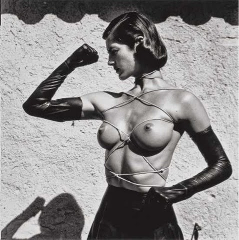
My initial response to Newton's work is to think, at first glance, that his bodies of work are based around the idea of male dominance however when looking deeper at the images I realise that there is more to these photos. I realised it is actually the complete opposite. I feel it is to express female dominance and their control over men. In this first photo you see that a man is grabbing the women in a way which looks like he has no permission to do but she lets him, but also seems as though she doesn't even care about what he is doing and doesn't take notice, Enforcing the idea of female dominance.
                The meaning or purpose I feel could be for both commercial use and fine art. I feel it would be used commercially because in the photographs there are clearly branded products, for example the watch in the first photo. However, in images with no clear products, the focus is the narrative of the image and that idea of female dominance. The images look very professional apparent by the quality of the images. However most of the images are done on location, I feel this is because it brings out more of the story within the image.
                   Almost all of his images are in black and white with a high contrast. This is probably to enforce the idea of a higher class and elegance. Because of this it also plays a role in the narrative of the photo because we associate black and white with elegance which tells us something about the photo. I noticed that a lot of his work is done using low key lighting which creates quite a negative atmosphere on the photograph.
                  It's easy to understand how is work is something to be negatively criticised for being sexist and objectifying to women. However, I feel that if you look deeper within the images you find that it is not. These negative opinions are probably from people who are not educated in art and the ones who prove these opinions wrong are people like writers of the BJP.


Monday 11 May 2015

Interview: Dave Thompson

What equipment did you use? 
Fuji rdp100 film
Haslsselblad film camera
Large tripod
Bowens quad lighting
1/8 warm up filter 
90mm lens
What was the meaning or purpose of the shoot?
Primarily it was a test shoot however after shooting loads of girls in a blank background, he found that the background is very important. The narrative is very basic in that it's simply about to have sex with that girl.
What drove you to use transparency film?
At the time, if you wanted to be set apart from the amateur photographers, this is what you used.  
What or who were your influences? 
Ian sprat, was a page three photographer for the daily mail. Dave, at that time, wanted to shoot those sort of photographs as his career. 


Dave Thompson

My initial response to daves work is that there doesn't appear to be much narrative. The work seems quite commercial, possibly test shoots for an agency. I feel the lack of narrative may be because it is not personal work and could may be used for advertising instead of being exhibited. The images appear to be quite formal, using professional equipment, apparent by the quality of the images.
                  The meaning or purpose of the images, I feel, would be used for advertising or modelling. Or another purpose could be used as pornography. The model is looking directly looking at the viewer, enforcing this idea of provocative photography. She is wearing very provocative clothing, not something to be worn every day, it looks as though she is looking for sex and has prepared for it. It's quite objectifying in that you don't really learn anything about the model other than she appears to be a sex object.
                  The colour used in these images appear to be quite saturated and use very warm colours. This maybe a use of visual language, in that these warm colours are very advertising to a viewer, enticing them to join her. The clothing the model is wearing seems very elegant implying a higher class of person, the bedroom also has a similar effect in that it appears quite expensive. 
                 The equipment used appear to be quite professional, using maybe an expensive camera and lighting 


Tuesday 5 May 2015

Nobuyoshi Araki

My initial reaction to his work is to be stunned how blunt it is and he's simply having sex with his clients. The images appear to be informal because it looks as though it is ambient light used. It makes me question if this is used as art or an excuse to have sex with naive models. It's clear that his work is considered controversial and I can imagine that his work was often ridiculed and discarded as sexism.
            The meaning or purpose for these images are, I feel, very vague. It is difficult to have an educated guess as to what the meaning might be. After asking a student what they feel is the meaning, to which he thought that maybe his work was to express his own fetishes and sexual desires with no regard to sexism. I find it very objectifying to women amongst a lot of other people who have reviewed his work. Some images varie in how some look very professional in that they have clearly been done in a studio with flash and other look less professional with ambient light and a very low quality.
                  Because some images appear to be professional and others not, this is visible when it comes to the colour. Some images have a very high contrast with both true blacks and true whites. However others are very soft with lots of greys. This has an effect on visual language in that the ones with a high contrast appear to very elegant and more pressional, whereas the photographs that are soft appear unprofessional and look more so the subject are of a lower class. Most of his photographs are in black and white, this gives a quite dark and gloomy atmosphere to the images.
                 I personally feel that his work is very objectifying. It seems as though he has used the idea of being a professional photographer to sleep with and use these models, taking advantage of naive models. It's easy to understand why his work is controversial and subject to a lot of criticism.